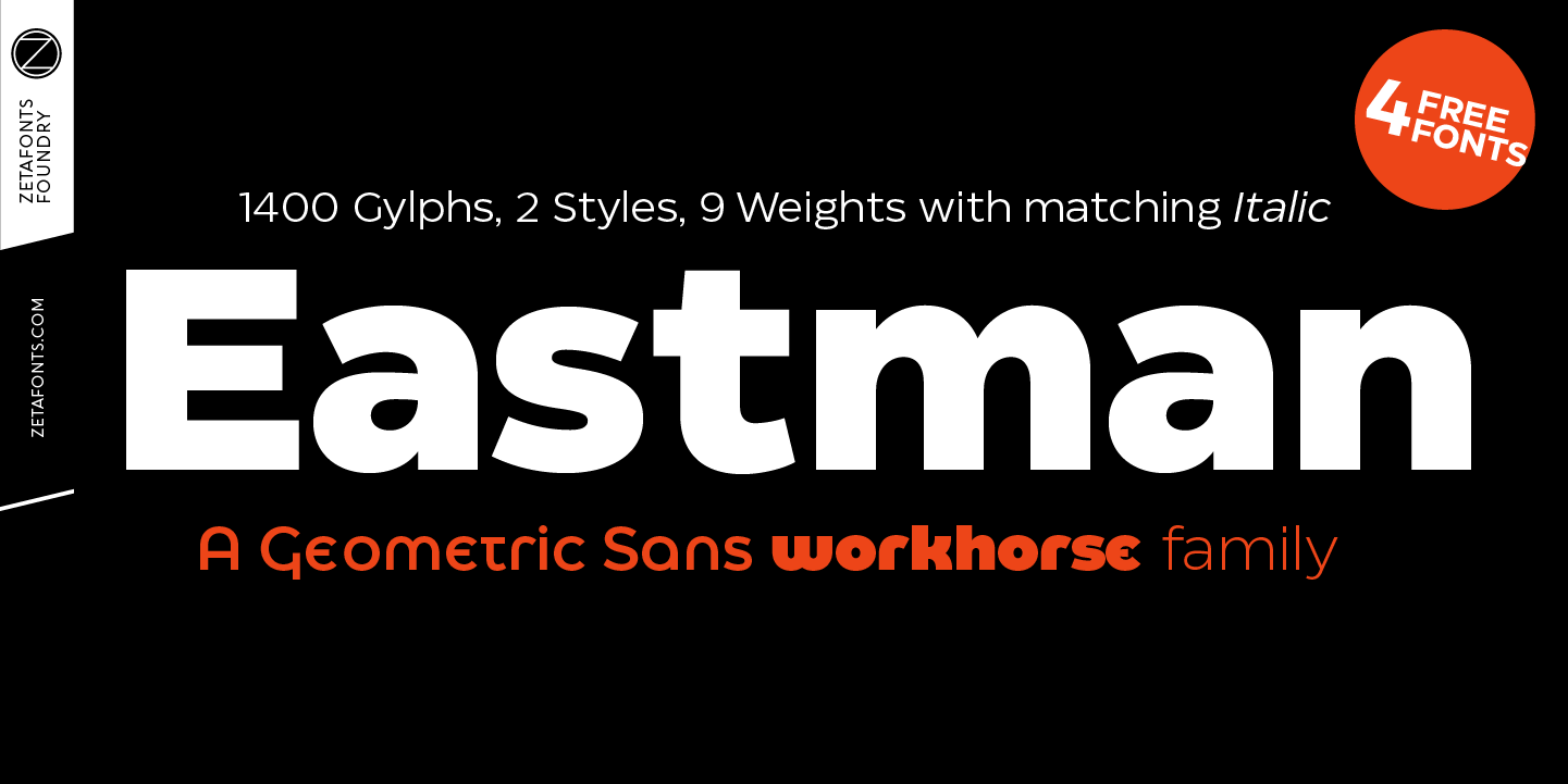
Eastman Trial Sans Serif
Eastman was designed in 2020 for Zetafonts by Francesco Canovaro and Andrea Tartarelli with help from Solenn Bordeau. It is a geometric sans workhorse family developed for maximum versatility both in display and text use, with a wide weight range and a solid monolinear design featuring a tall x-height that makes Eastman extremely readable on paper and on the screen.
Influenced by Bauhaus ideals and contemporary minimalism, but with a nod to the pragmatic nature 19th century grotesques, Eastman has been developed as a highly reliable tool for design problem solving, and given all the features a graphic designer needs - from a wide language coverage (thanks to over one thousand and two hundred latin, cyrillic and greek characters) to a complete set of open type features (including small capitals, positional numbers, case sensitive forms).
An impressive array of alternate characters and stylistic sets allows to fine-tune your editorial and branding design by choosing unique, logo-ready variant letter shapes. The twenty weights of the base family have been complemented by a display-oriented alternate family, as well as one variable version, bringing the full family to an impressive count of 41 fonts. Eastman excels in both body text, headings and wordmarks and it is your new option for a universal geometric grotesque.
Commercial licensing is available at zetafonts.com/eastman
